What Makes a Tote Bag Design Actually Cute (Not Just Busy)
There is a specific kind of disappointment that comes from a tote bag. You spot it online, charmed by the little thumbnail, and it arrives looking like a sticker sheet exploded across a canvas rectangle. The cute tote bag designs that actually earn a spot on your arm are rarer than the ones that just try hard to fill the space. This is a guide to telling the difference before you buy, whether you are shopping for yourself or picking one out for a friend who deserves better than clip art.
We spend our days designing totes, so we have opinions about what separates a design that feels considered from one that feels like a placeholder. None of it is complicated once you know what to look for. It comes down to a handful of choices an illustrator makes, mostly invisible until you notice them, and once you notice them you cannot unsee it.
Why some cute tote bags feel special and others feel like clip art
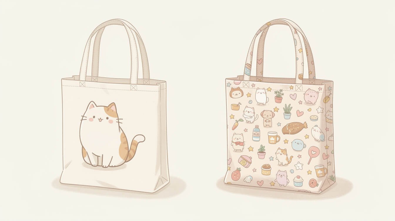
Open ten tote bag listings and you will notice a pattern fast. Half of them look like a graphic designer sat down, decided on one small idea, and trusted it. The other half look like every cute motif that fit got added in, one after another, until the bag reads as noise instead of a picture.
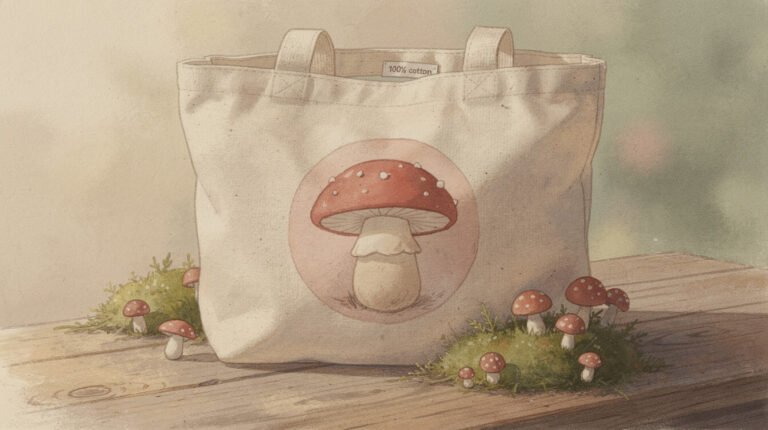
The gap is not about skill, or even about how much the artist charged for their time. It is about restraint. A design that feels special almost always has a single point of focus your eye lands on immediately: one mushroom, one round cat, one little basket of strawberries. A design that feels like clip art usually has three or four unrelated cute things scattered around a blank tote with no logic connecting them, like a mood board that got printed by accident.
There is also a texture difference. Special designs tend to have some hand-drawn quality in the linework, even when the piece is made digitally: a slightly uneven line, a little wobble in the outline that says a person made a decision here. Clip art, on the other hand, is usually built from perfectly smooth vector shapes dropped in from a stock library, and your eye can tell the difference even if you could not explain why.
Scale is another quiet tell. A design made with intention tends to be sized to fit the bag it lives on, with margins that feel considered, room to breathe on every side. A design pulled from a generic template often looks slightly too small or slightly too large for its canvas, floating in the middle of too much blank space or crowding right up to the seams, because it was never actually designed for a tote bag in the first place, just resized to fit one. Once you start noticing proportion, it becomes one of the fastest ways to sort a considered design from a stock one at a glance.
The one-motif rule: a single confident subject beats a busy scene
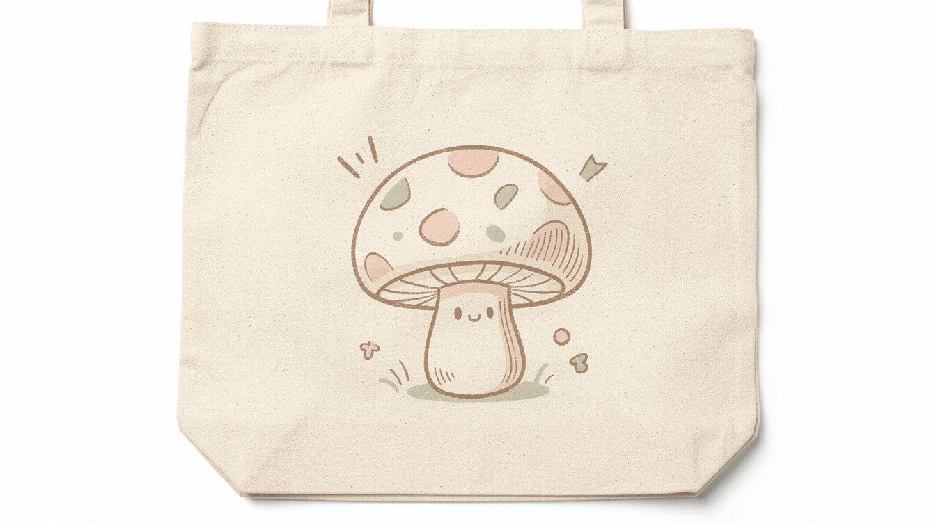
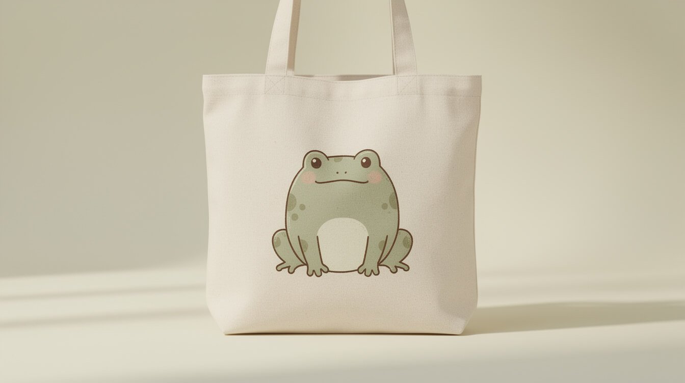
If you remember only one rule from this whole guide, make it this one. The best cute tote bag designs almost always commit to one subject and let it take up real space. A single round frog holding an umbrella. One sleeping cat curled into a comma shape. A lone teacup with steam drawn as a soft curling line. The subject gets room to breathe, and your eye never has to decide where to look first.
Busy scenes try to do more and end up doing less. A tote covered in a cat, a mushroom, three stars, a rainbow, and a banner that says something twee will always read as more cluttered than a single well-drawn cat, even though the busy version technically has more content. More is not more here. A confident subject with generous white space around it reads as intentional. A crowded scene reads as an attempt to cover every base at once, which usually means no base got covered well.
This does not mean a design needs to be minimalist in the trendy, sparse sense. A single subject can still have detail: little whiskers, a patterned sweater, a tiny expression. The rule is about focus, not about how much ink is used. One thing, done with care, wins over five things done in a hurry.
It helps to think about how the eye actually reads an image. Given a scene with five equally weighted elements, the eye has to work to decide where to settle, and that small friction is what makes a design feel busy even before you consciously notice why. Given one clear subject with everything else acting as quiet support, the eye settles instantly and the whole thing reads as calm, even if the subject itself is doing something energetic, like a cat mid-pounce or a frog mid-leap. Calm and cute are not opposites. Some of the most charming designs are quite lively in what they depict. The calm comes from the composition, not from the subject sitting still.
Line weight and color count: how illustrators keep it soft, not cluttered
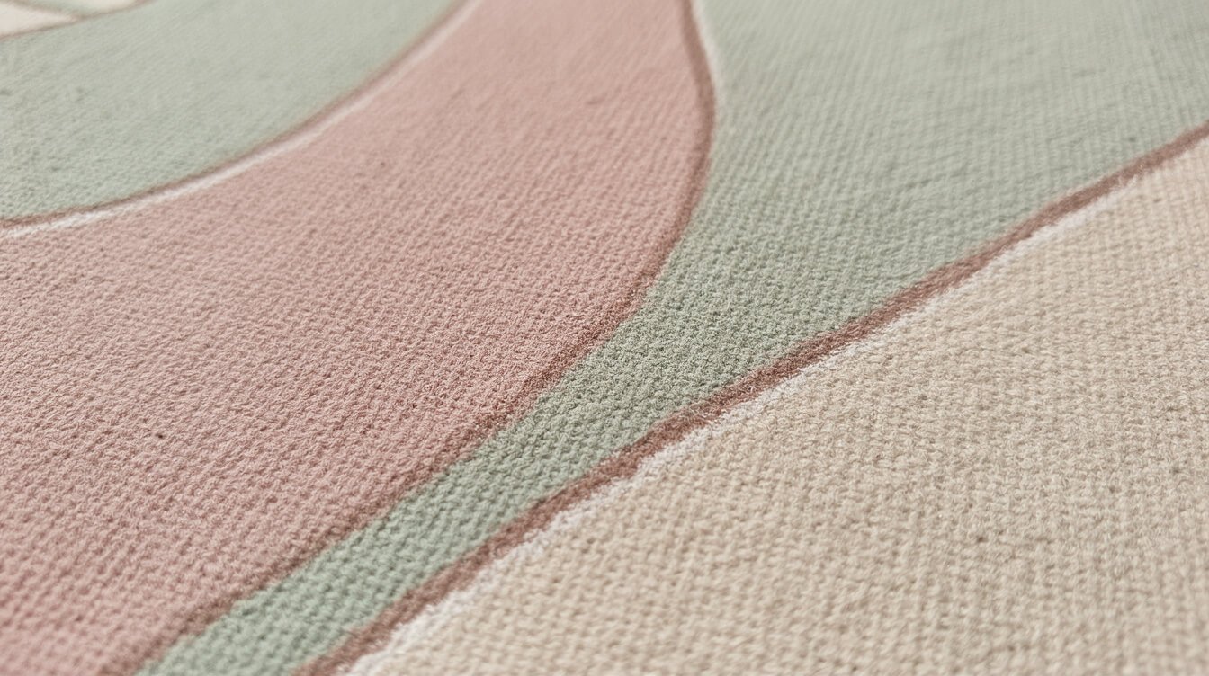
Two more technical choices decide whether a design feels soft and cohesive or busy and cheap: line weight and color count.
Line weight is how thick or thin the outline of a drawing is. Illustrators who want a design to feel cozy and approachable tend to use a consistent, slightly heavier line, the kind you see in picture books. That weight does a lot of quiet work: it makes small shapes read clearly from a distance, and it gives the whole piece a handmade, storybook warmth instead of a sharp, corporate-logo crispness. Watch for inconsistency here. If some lines are thick and confident while others are thin and scratchy in the same piece, it usually means the design was assembled from mismatched elements rather than drawn as one cohesive piece.
Color count matters just as much. The cute tote bags that feel considered typically stick to a tight palette, often four to six colors including the fabric itself, chosen to sit well together: a dusty pink, a sage green, a warm cream, maybe one saturated accent for the subject’s cheeks or a small detail. Designs that lean toward clip art territory tend to reach for every color available, because more colors feel like more value, when really a tight palette is what makes a small illustration look intentional on a large blank canvas.
A good trick when you are shopping: zoom into the product photo and count the actual colors used, ignoring the fabric. If you get past six or seven, especially in a small design, that is often the tell.
Placement matters: centered, corner, or all-over print
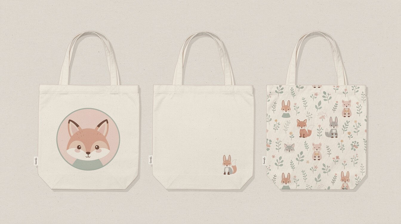
Where a design sits on the bag changes how it reads just as much as the drawing itself.
Centered, large
A big centered design is the boldest option and the least forgiving. It needs to be genuinely good, because there is nowhere for a weak illustration to hide. This placement suits a strong single subject with real presence, the kind of design confident enough to be the whole point of the bag.
Corner or pocket-sized
A smaller design tucked into the lower corner reads as quieter and more everyday-wearable. This is the placement to reach for if you want something you would genuinely carry to work or the grocery store rather than only on a themed day out. It also tends to age well, since a subtle design does not announce itself as loudly over years of use.
All-over print
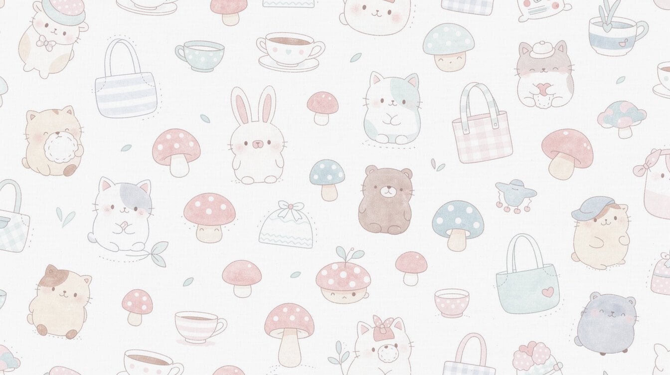
All-over prints, where a pattern repeats across the whole bag, are their own category and live or die on the pattern’s rhythm. A good all-over print has a repeat you cannot immediately spot, varied spacing, and enough negative space to keep it from feeling like wallpaper. A weak one has an obvious, mechanical repeat that gets busier the longer you look at it, which is exactly the clip art feeling this whole guide is trying to help you avoid.
If you are shopping for a design to go with a specific cottagecore outfit, a smaller corner placement usually blends more naturally into a soft, layered look than a large centered graphic competing for attention.
There is a fourth placement worth naming too: the small standalone motif set slightly off-center rather than dead center or tucked into a corner. Think of a single mushroom sitting just above and to the left of where a centered design would land. This placement tends to feel more relaxed and less symmetrical than a strict center print, closer to how a favorite sticker looks placed on a notebook by hand rather than printed by a machine. It is a small distinction, but it is often the difference between a design that feels art-directed and one that feels genuinely personal.
Fabric and print quality: what makes a design last past one wash
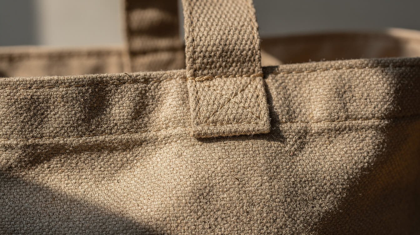
A cute design on a tote bag that cracks after two washes is not actually cute, it is a design you will stop using. A few things to check before you buy.
- Print method. Screen printing and quality digital direct-to-garment printing tend to hold up better than cheap heat transfers, which are the vinyl-feeling prints that crack and peel along the edges after a handful of washes. Listing photos rarely say the print method outright, but reviews almost always mention it if it is a problem.
- Canvas weight. A tote described as lightweight cotton will sag and stretch faster than a mid-weight canvas, especially once you start actually using it to carry things. Heavier canvas holds its shape and holds up the print better too, since it flexes less.
- Stitching at the strap seams. This is where cheap totes fail first, long before the print does. Reinforced stitching or a bar-tack at the strap base is worth looking for in photos if the bag is meant for daily carry rather than as a decorative piece.
- Reviews that mention washing. A handful of reviews mentioning the print held up after multiple washes is worth more than any marketing copy on the page.
It is worth trying the fold test before you buy, when the listing allows it, or checking for it in review photos afterward. Fold the fabric where the print sits and look closely at the crease. A quality print flexes with the fabric and shows no cracking along the fold. A cheap heat-transfer print often shows a faint white line right where the fold happened, the first sign of the peeling that will get worse with every wash after that. Review photos are your best friend here, since sellers rarely photograph their product creased on purpose, but customers folding a bag into a drawer will show you exactly how it holds up.
If you already love the way we think about small, well-made things, our guide to building a stationery kit you will actually use covers the same idea from a different angle: cute only counts if it holds up to daily life.
Matching a tote design to how you will actually use it
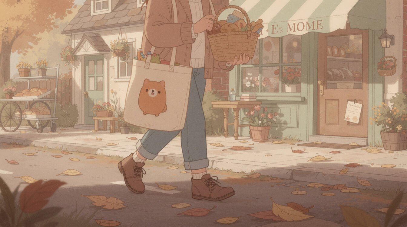
The best design for a display shelf is not always the best design for your actual life, and it helps to be honest about which one you are shopping for.
Daily carry. If a tote is going to be your grocery bag, your library bag, the one that lives by the door, choose something quieter: a corner placement, a muted palette, a subject you will not tire of seeing every single day. The tote you reach for without thinking is the one that earns its keep.
A gift for a specific person. This is where you can go bigger and bolder, because you are choosing for someone else’s joy in that one moment of unwrapping it, not for years of your own daily use. A large centered frog for the friend who is extremely into frogs, a bold cottagecore mushroom scene for the person whose whole personality is a cardigan and a thermos of tea. Let the design match the person, loudly if that is who they are.
A treat for yourself. Somewhere between the two. Pick the design that made you smile without needing to think about it, the one that passed the test this whole guide has been building toward: one confident subject, colors that sit together, linework with a little warmth in it. If it passes that test, it will probably still make you smile in a year.
Frequently asked questions about cute tote bag designs
How can I tell if a tote design is original art or a licensed-character knockoff?
Original designs usually have a distinct, slightly imperfect style, since they were drawn by one illustrator with their own habits and quirks. If a character looks close to a specific, instantly recognizable trademarked property, especially anything from a well-known animation studio or character brand, treat that as a signal to look elsewhere. Beyond the ethics of it, knockoff prints are almost always the lowest-effort, lowest-quality option on the page, since no real design work went into them.
Is a hand-drawn look always better than a clean vector design?
Not always. Clean, simple vector work can be lovely when it is done with the same restraint this guide describes: one subject, a tight palette, thoughtful placement. The hand-drawn quality is a strong signal, not a strict rule. What matters more than the technique is whether the person behind it made confident, intentional choices.
What is a fair price for a well-made cute tote bag?
Pricing varies a lot by canvas weight, print method, and where it is made, and we would rather point you to a specific product page than guess at a number here. As a general compass, a tote priced dramatically below everything else in a similar style is worth a closer look at the print method and reviews before you buy.
How do I keep a printed design looking good over time?
Wash cold, turn the bag inside out before washing if the print covers a large area, and skip the dryer’s high heat setting when you can, air drying or a low tumble instead. Prints fail from heat and friction more than from anything else.
Does a bigger design always mean better value?
Not necessarily. A large all-over print takes more production work than a small motif, so it is not unreasonable for it to cost more, but size alone does not make a design better. A well-placed, well-drawn small motif can easily outlast and out-charm a large busy print that cost more to produce. Judge the design on the rules in this guide first, and let size be a secondary factor, not the deciding one.
What should I look for in listing photos before I trust a design?
Ask for, or look for, a photo of the tote being carried or worn in daily life, not just laid flat on a clean background. Flat product photos can hide proportion problems that become obvious the moment a bag is actually slung over a shoulder. A design that still looks balanced and intentional in a real, in-motion photo has usually earned that balance rather than relying on careful studio staging.
Final thoughts: cute and well made are not a tradeoff
The best cute tote bag designs are not the ones trying hardest to be cute. They are the ones made by someone who trusted a single good idea and gave it room to be seen clearly, printed onto a bag sturdy enough to actually carry your groceries home. Once you start looking for the one-motif rule, the tight color palette, and the honest stitching, you will find it hard to settle for the crowded, clip-art version again.
If you want to see what that looks like in practice, our shop is full of small, considered designs made the way this guide describes. No rush to decide today. Just something worth having when you are ready.