What Pastel Aesthetic Actually Means (and Why It Feels So Good)
Pastel aesthetic is the easiest thing in the world to point at and the hardest thing to actually describe. You know it when you see it: a soft blush wall, a butter yellow mug, a sage green sweater that looks like it was dipped in a spring morning. But pastel aesthetic is more than a color palette you save to a Pinterest board. It is a whole approach to a room, an outfit, or a gift, one that trades loud for gentle and still manages to be memorable.
We will go through what the term actually means, why these particular colors do something to your nervous system that brighter ones do not, how pastel sits next to its cousins kawaii and cottagecore without being either one, and how to bring it into your own life without buying a single new thing you do not need. Settle in. This one is meant to be read slowly.
What pastel aesthetic actually means
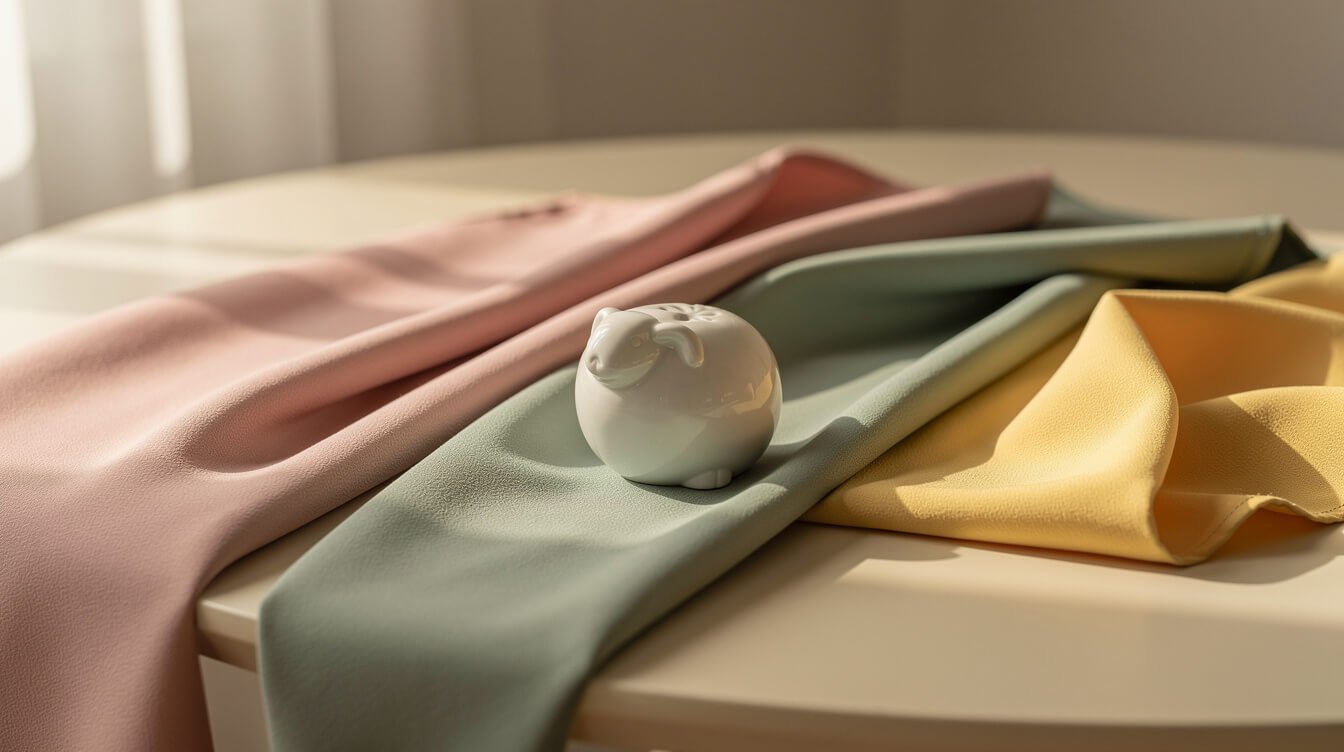
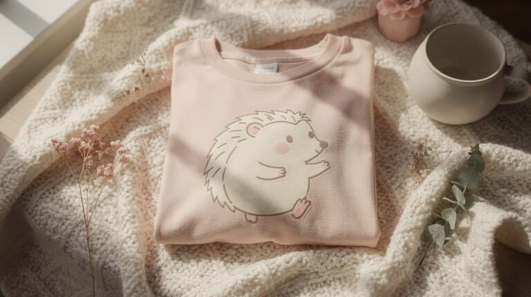
At its simplest, pastel aesthetic describes a visual style built from desaturated, light-value colors: blush pink, sage green, butter yellow, powder blue, lilac, a warm off white that ties them all together. Take any hue, add a generous amount of white, and you get its pastel version. The color is still there, but it is turned down, softened, made easier to sit with for long stretches of time.
As an aesthetic rather than just a color scheme, pastel aesthetic usually shows up with a few other habits attached. Surfaces tend to be soft and matte rather than glossy. Shapes lean round over sharp. There is a preference for a few well chosen pieces over a room or an outfit stuffed with pattern. And there is almost always a sense of restraint, one dominant pastel with a neutral to support it, rather than five competing pastels shouting over each other.
The aesthetic has roots in a lot of places at once: 1980s Miami pastels, Japanese kawaii color theory, the soft-focus world of early Tumblr photography, and a design instinct that has been around far longer than any of those, the simple observation that pale colors read as gentle and safe. What makes it feel current again is less about any one origin and more about a collective craving for softness after a long stretch of visual noise everywhere else.
It is worth saying plainly that pastel aesthetic is not the same thing as looking like a child’s nursery, which is the objection it runs into most. The difference is in the restraint and the material. A pastel room built from one confident color, a few textures, and pieces that were actually made well reads as considered. A pastel room built from every available pale-colored item at once reads as an accident. The aesthetic rewards editing.
Why soft colors feel calming
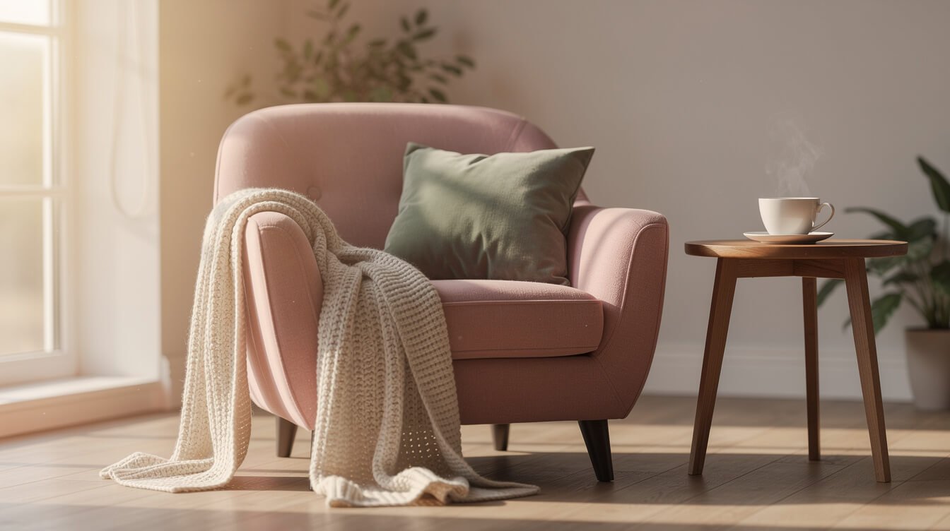
There is a real, unglamorous reason pastel colors feel the way they do, and it comes down to contrast. High-saturation colors demand attention because they are built to. Fire engines are red for a reason, and stop signs are not sage green. Your eye and, downstream of it, your nervous system, read saturated color as urgent. Desaturated color reads as safe simply because it is quieter on the same signal.
Lightness does something similar. Pale colors reflect more light back at you, which our brains have long associated with open, daytime, low-threat environments, as opposed to the deep shadowed tones that read as cave, night, or hidden. None of this requires believing in strict color psychology as a science to notice that a blush pink bedroom feels different in the body than a crimson one, even before you consciously register why.
There is also a simple design mechanism at work: pastel palettes are, almost by definition, low contrast. Low contrast environments ask less processing of your eyes. A room with twelve saturated colors competing is a small amount of visual work every time you look around it. A room built from three pastels and a cream base is close to visual rest. That is not a coincidence, and it is a big part of why the aesthetic keeps resurfacing whenever a stretch of collective life feels overstimulating.
None of this means bright colors are wrong or that a pastel palette is somehow more correct. It means pastel aesthetic is doing a specific, useful job: turning a space or an outfit into something that asks less of you, on purpose, in a world that mostly does not.
Pastel vs. kawaii vs. cottagecore: how they overlap and differ
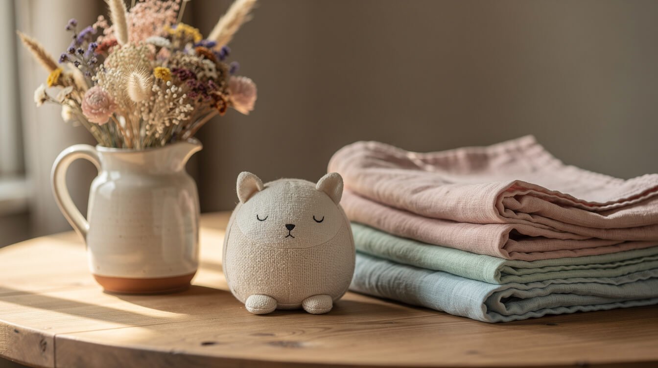
Pastel aesthetic, kawaii, and cottagecore get lumped together constantly, and it is easy to see why. All three lean soft, all three avoid loud or aggressive styling, and all three share a fondness for gentle color. But they are answering different questions, and knowing the difference will save you from buying a room’s worth of things that do not actually sit well together.
Pastel aesthetic is a palette first. It is not tied to a single mood or era. You can build a pastel look that is modern and clean, or one that is soft and nostalgic, or one that leans playful. The one constant is the desaturated, light-value color story. If you want a deeper walk through the kawaii side of this, our guide to kawaii room decor that feels cozy, not cluttered covers where softness turns specifically playful.
Kawaii is a mood first, and it usually borrows pastel as one of its tools rather than being defined by it. Kawaii means cute in the specific Japanese sense: round shapes, small creatures with expressive faces, a sense of harmless charm. Kawaii pieces are very often pastel, but a kawaii design can also show up in black and white, or in a bold primary color, and still read as kawaii because of the shape language, not the palette.
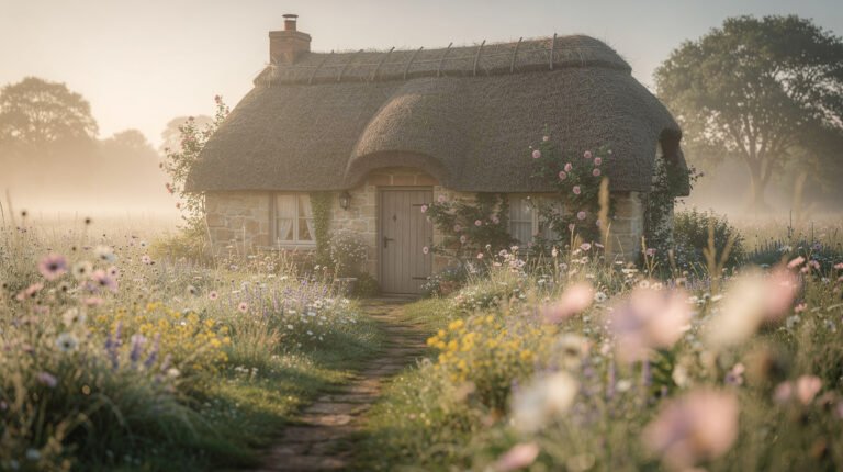
Cottagecore is an era and setting first. It draws from a romanticized, pre-industrial countryside: dried flowers, worn linen, handmade ceramics, warm wood. Cottagecore’s colors trend earthy and muted rather than strictly pastel, more sage and cream and rust than bubblegum pink. Where pastel aesthetic often reads clean and a little modern, cottagecore reads lived-in and textured. If that side of soft living is what you are drawn to, our full guide to what cottagecore actually is is the place to start, and cottagecore aesthetic outfits covers how it translates to what you wear.
The three overlap constantly and none of them are rules you have to pick one from. A lot of the rooms and outfits that work best borrow the palette from pastel, the shapes from kawaii, and the texture from cottagecore, and never announce which one they are trying to be.
Pastel aesthetic beyond the bedroom
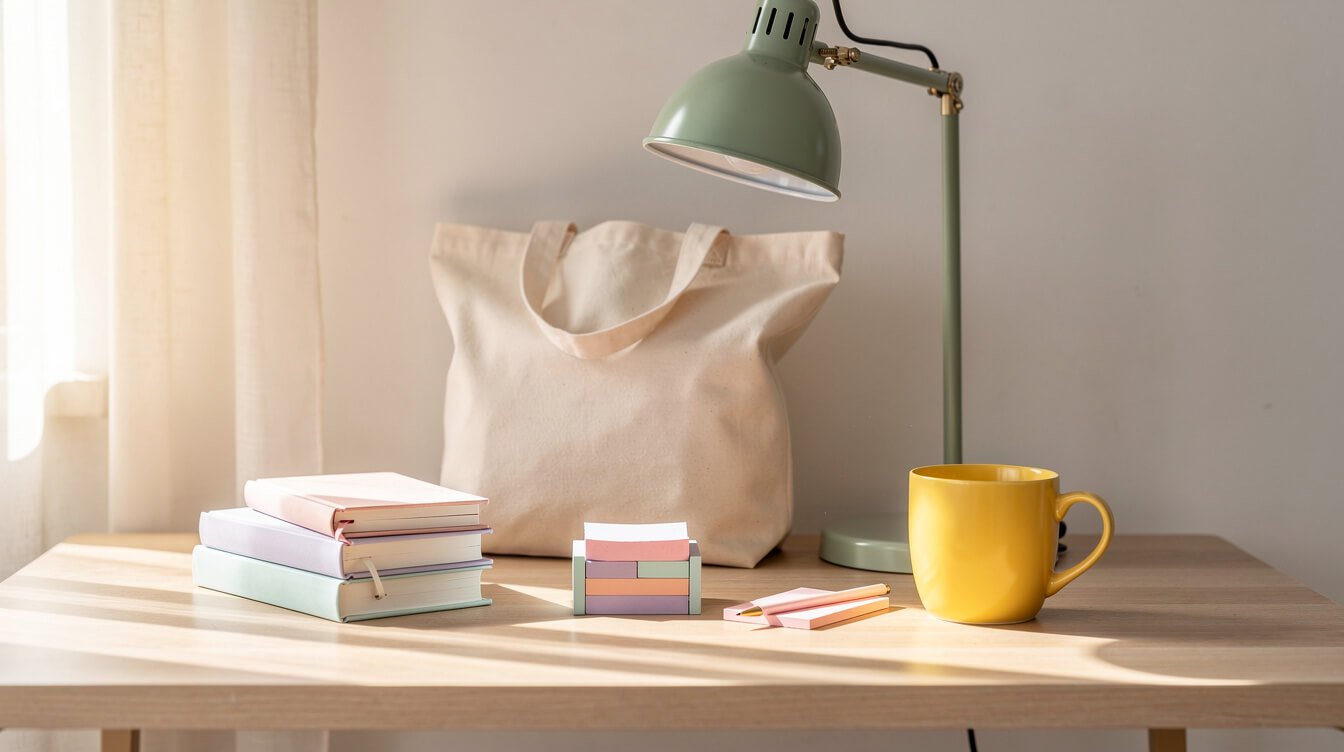
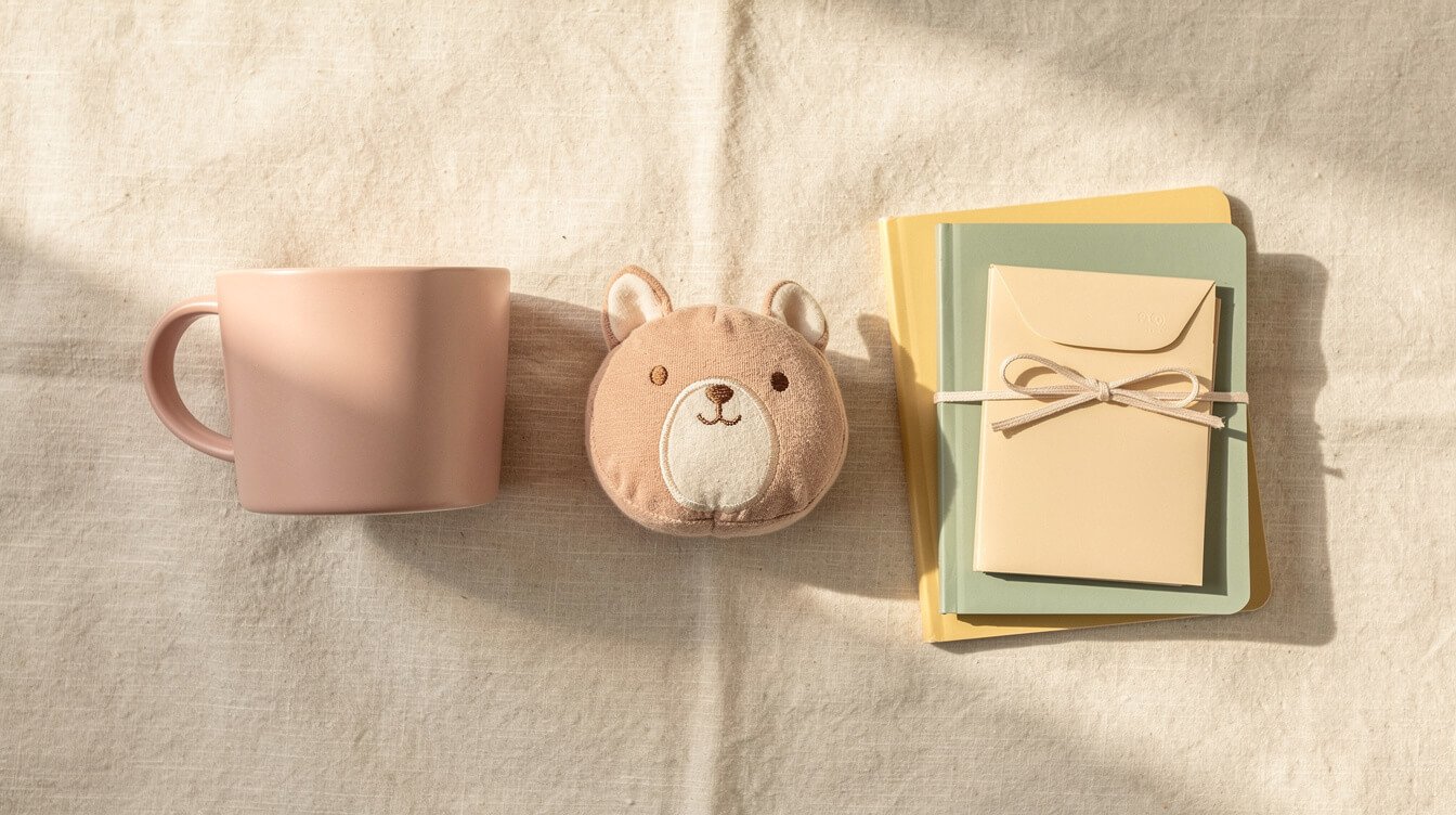
Most pastel aesthetic content stops at the bedroom, which is a shame, because the palette holds up just as well anywhere you spend real time. A desk is an obvious next step. A butter yellow mug, a small stack of pastel stationery, a soft sage lamp, and suddenly a corner that used to feel purely functional has a little warmth in it. If you want to go further with the stationery side specifically, we have a guide to building a stationery kit you will actually use.
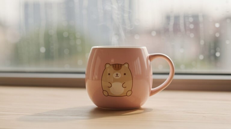
Kitchens take pastel well too, in small doses: a mug in a color you love sitting on an otherwise neutral counter reads as intentional rather than themed. A single well-made piece does more here than a whole cabinet of matching pastel dishware, which can tip quickly into looking like a prop set. Our guide on choosing a cute mug that actually lasts is worth a look if this is where you want to start.
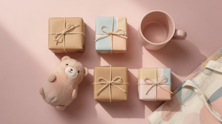
What you carry counts as much as what you keep at home. A tote bag in a soft palette, a keychain, a phone case, these are the lowest-commitment ways to bring pastel aesthetic somewhere with you, and they travel well into an office or a classroom that would otherwise read too neutral to touch.
The throughline across all of these is the same one from the bedroom: pick a color, or two at most, and let it repeat in a few places rather than spreading five different pastels across every surface you own. Consistency, more than volume, is what makes an aesthetic read as considered rather than accidental.
Building a pastel palette you won’t get tired of
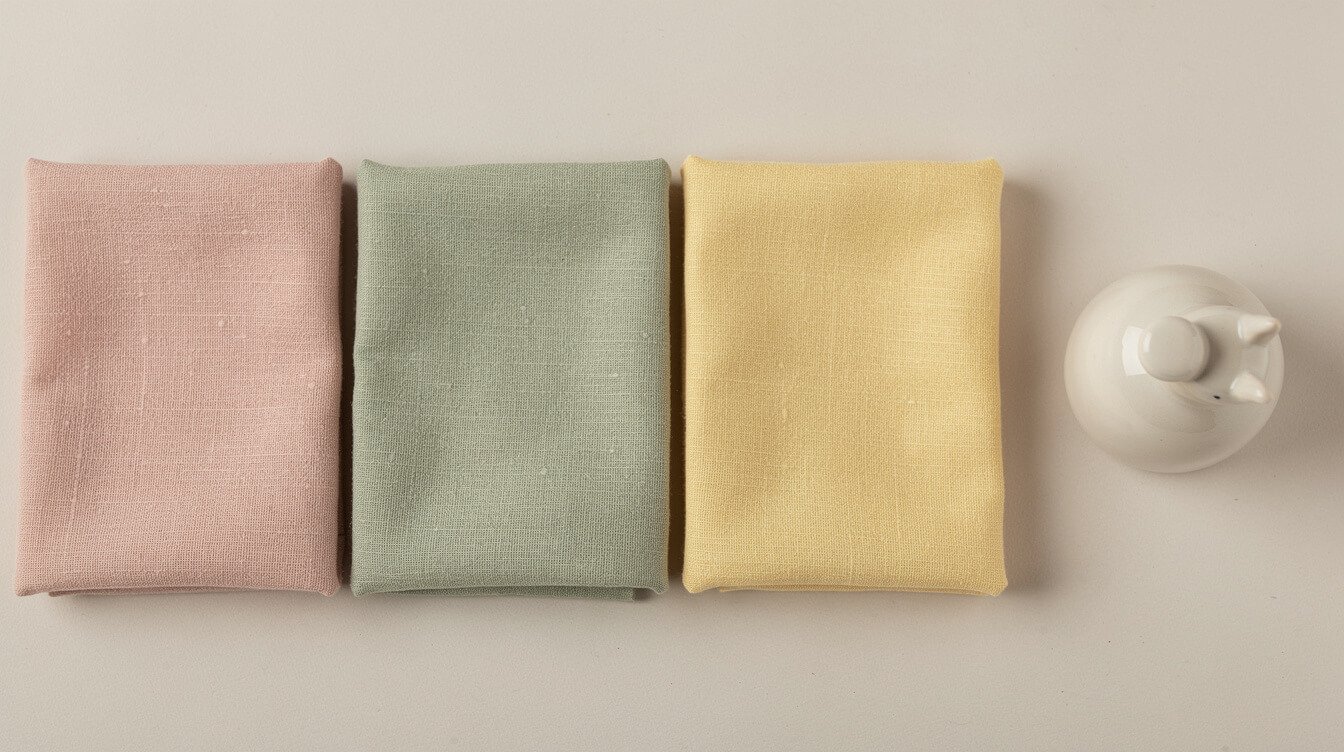
The single biggest mistake in building a pastel palette is picking colors because they are trending rather than because you actually like living with them. A palette you will still love in two years starts with one color you are genuinely drawn to, not the one currently everywhere online.
Start with one anchor pastel. Blush pink, sage green, and butter yellow are the three that tend to age best because they read as warm rather than sugary, but the honest answer is that your anchor should be whichever pastel makes you feel calmer just looking at it. Sit with paint chips or fabric swatches for a week before committing to anything permanent.
Pair your anchor with a warm neutral, cream or a soft off white rather than stark white, which can make pastel read cold and clinical instead of soft. The neutral is doing most of the quiet work in the room. It is what keeps the palette from feeling like a costume.
Add a single accent, at most, in a slightly deeper or slightly different pastel. Two pastels plus a neutral is a palette. Five pastels plus a neutral is a mood board that never quite settles into a room. If you are shopping for pieces to build this out, keep the accent color in mind and buy toward it deliberately rather than picking up anything pastel that crosses your path.
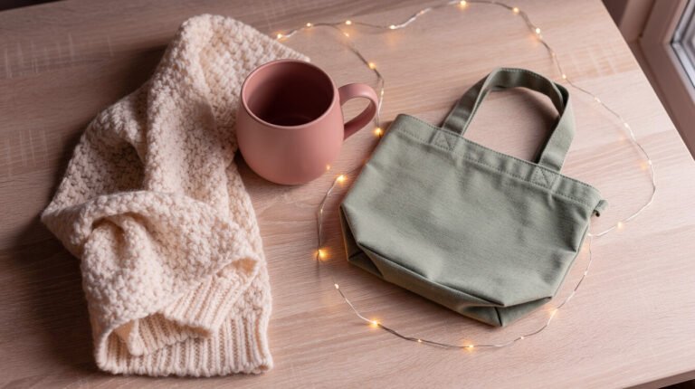
Last, give the palette texture, not just color. A blush pink room in three different fabrics, a woven basket, a knit throw, a smooth ceramic mug, reads far richer than the same blush pink in three flat surfaces. Texture is what keeps a soft palette from going flat or looking like it came out of a single box.
Small pastel touches to start with
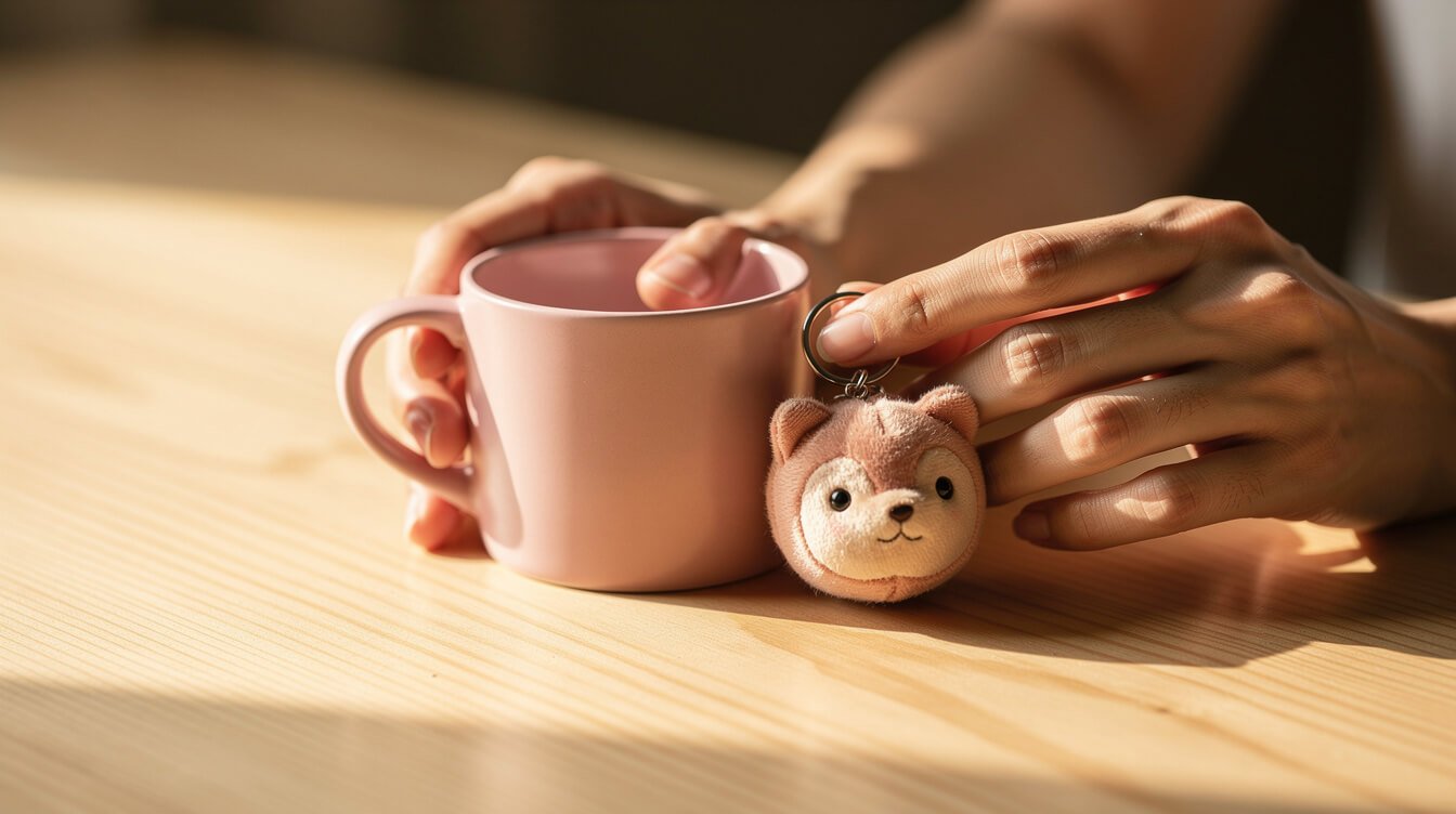
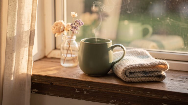
You do not need to repaint a room to try this aesthetic on. Start with something you already touch every day. A mug is the classic entry point for a reason: you see it every morning, it costs little to try, and swapping it back out is painless if the color turns out not to be the one.
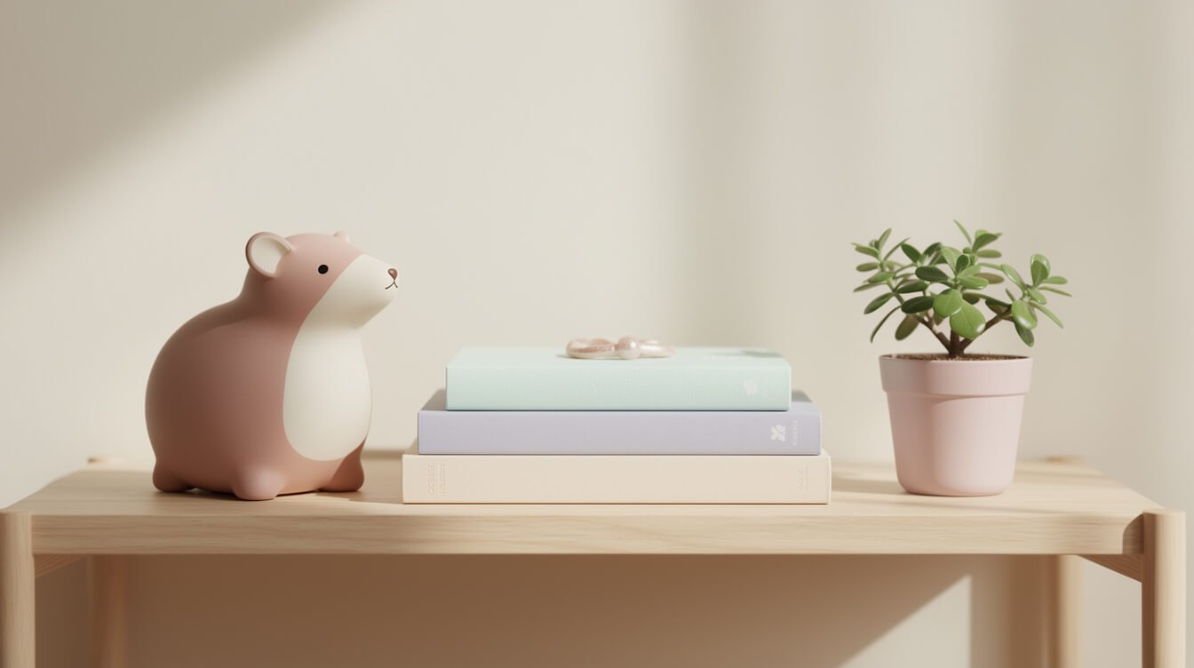
A small object on a desk or nightstand is the next easy step. A round animal figurine, a little dish for jewelry, something with a bit of personality in your anchor color. These pieces do a lot of aesthetic work for how little space they take up, precisely because they are the kind of thing your eye lands on repeatedly through the day.
Textiles are the lowest-risk, highest-impact category if you are ready to go slightly bigger. A throw blanket, a set of pillow covers, even a single towel in your anchor pastel will shift how a whole room reads without requiring you to replace any furniture.
And if you carry a bag, wear a shirt, or hold a water bottle every day, that is your aesthetic on the move. A tote in a soft palette color does more for how consistently “you” the aesthetic feels than an entire redecorated room that you only see at home. Start small, live with it for a week, and let the next piece follow from what you actually kept reaching for.
Frequently asked questions
Is pastel aesthetic the same as kawaii?
No, though they overlap often. Pastel aesthetic is a color palette, desaturated and light valued. Kawaii is a mood built around round shapes and gentle charm, and it frequently uses pastel colors as one of its tools without being defined by them.
What colors count as pastel?
Any hue with a large amount of white mixed in reads as pastel. The most common in the aesthetic are blush pink, sage green, butter yellow, powder blue, and lilac, usually paired with a warm cream or off white.
Does pastel aesthetic work in a small space?
It often works better in a small space than a large one. Because the palette is low contrast by nature, it tends to make a small room feel calmer and more open rather than cluttered, as long as you keep the color count to one or two anchors.
How do I keep a pastel palette from looking too sweet?
Lean on texture and restraint rather than volume. One confident pastel, a warm neutral, and a few well-made textured pieces reads considered. Five pastels at once, especially in glossy or plastic finishes, is what tips the look toward sugary instead of soft.
Can pastel aesthetic work for someone who isn’t young?
Yes, entirely. The association with youth is cultural, not built into the colors themselves. A sage green and cream palette, in particular, reads sophisticated at any age. Cute, and calm, are for everyone.
Final thoughts
Pastel aesthetic holds up because it is not really about the colors on their own, it is about what those colors ask of you, which is less than almost anything else competing for your attention. One anchor color, a warm neutral, a little restraint, and a room or an outfit starts to feel like a place to actually rest instead of another thing to keep up with.
If you want to try a few pastel, round-animal pieces of our own, made well rather than just made cheap and pale, you can see the current lineup any time in the shop. And if this kind of slow, useful read is what you come here for, our piece on kawaii room decor that feels cozy, not cluttered is a good next stop.