Why the Cute Mushroom Tote Bag Is Having a Cottagecore Moment
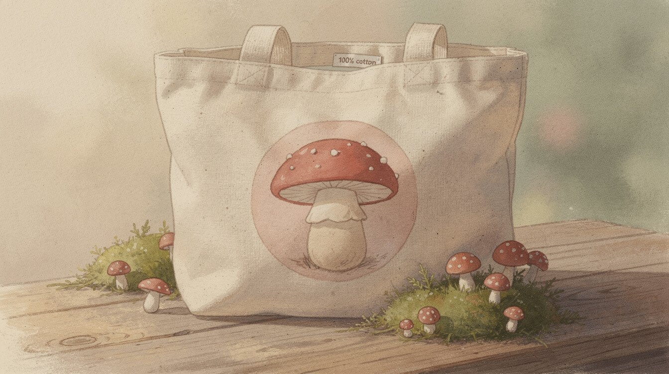
If you have scrolled a cottagecore board on Pinterest lately, you already know: the cute mushroom tote bag is having a moment. Round caps, soft dots, a stem that curves just so, they show up on canvas totes, embroidered patches, and the corner of a hundred aesthetic flat lays. It is a small motif doing a lot of quiet work, and it is worth asking why a mushroom, of all things, became this era’s shorthand for cute.
This is not a shopping list. It is a look at where the mushroom’s glow up came from, what separates a mushroom design that reads as genuinely cute from one that reads as try hard, and how to work a mushroom tote into an outfit without looking like you raided a craft fair on your way out the door.
The mushroom’s glow up from twee to cute
Mushrooms have been decorating things for a long time, and for most of that time they were firmly in twee territory. Think garden gnomes perched on plastic toadstools, kitchen towels printed with red-and-white spotted caps, the kind of grandmother-chic knickknack that got mocked in decorating blogs for a solid decade. Cute, technically, but cute in the sense of “harmless clutter” rather than cute in the sense of “something you would actually choose.”
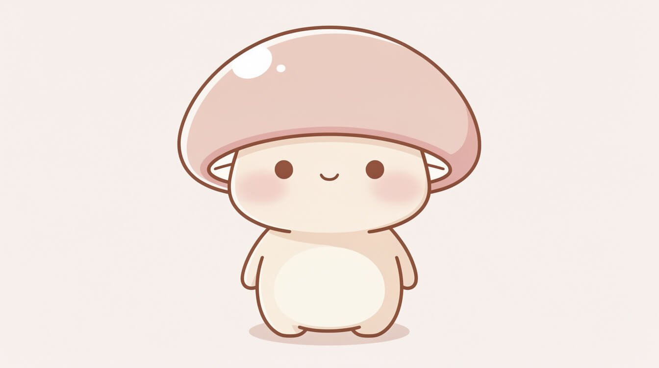
What changed is not the mushroom. It is the shape language around it. The mushrooms showing up on totes and patches now are rendered soft: rounded caps instead of pointy ones, muted sage and butter tones instead of primary red and white, a single confident illustration instead of a busy allover print. That is the same shift that took round animals from novelty to genuinely wearable, and it is the shift that separates a design you would keep from one that reads as filler.
It helps to think about it the way a lot of kitsch eventually gets reconsidered. Gingham went from tablecloth cliche to a genuinely stylish print once someone stripped it down to a single soft color story. Cat-eye glasses went from costume-party prop to a real shape once the lines got cleaner. The mushroom is going through the same process right now: the same subject, a completely different set of choices about how to render it.
Part of the shift is generational too. A lot of the people drawn to cottagecore grew up around exactly the twee mushroom decor described above, on a grandparent’s windowsill or in a childhood picture book, and there is a genuine nostalgia running underneath the trend rather than a rejection of it. The redesign keeps the warmth of that memory while quietly editing out the parts that felt dated. It is less a reinvention than a translation, the same comforting subject rendered in a visual language that feels current instead of inherited.
The twee version wanted your attention. The cute version earns it, then gets out of the way.
Where the trend is actually coming from
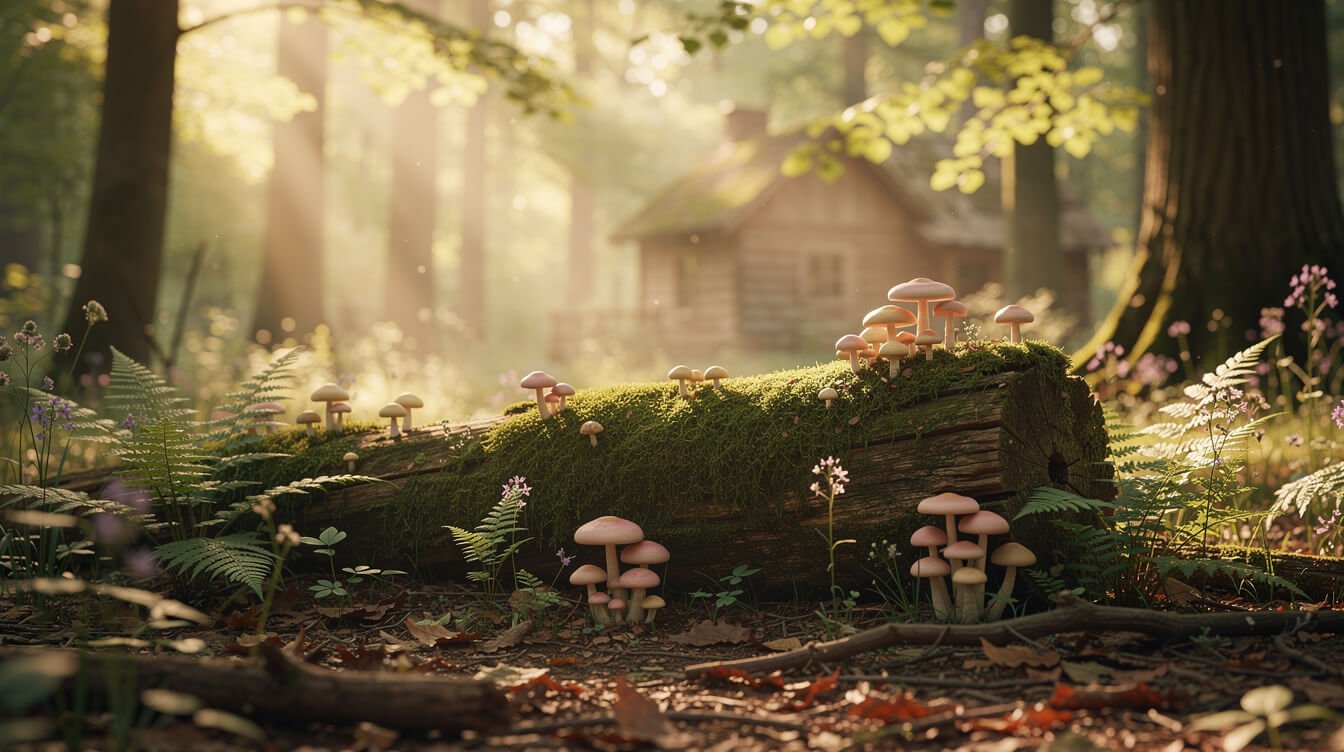
The short answer is cottagecore, but the fuller answer runs through a few overlapping ideas. Cottagecore itself is a slow-living aesthetic built around gardens, baking, hand mending, and a general suspicion of anything that feels rushed or manufactured. If you want the full picture, our guide to what cottagecore actually means covers the roots of the aesthetic in more depth. Mushrooms fit that world naturally: they grow slowly, they show up after rain, they belong to forest floors rather than factory floors.
Forestcore, a close cousin of cottagecore, pushed the mushroom even further into focus. Where cottagecore leans toward gardens and kitchens, forestcore leans toward moss, bark, and the quiet floor of a forest walk. A mushroom sits right at the center of that imagery. It is also, conveniently, one of the easiest natural shapes to draw as round and friendly, which put it on a collision course with the broader kawaii preference for soft, rounded forms over anything sharp or angular.
There is also a practical reason mushrooms translate so well to merch specifically. A cap and a stem is a simple, recognizable silhouette even at a small scale, which makes it forgiving on a patch, a pin, or the corner of a tote where a more detailed illustration would turn to mush (no pun intended, or maybe a small one). Designers looking for a motif that reads clearly from a few feet away, the way a good logo does, keep landing on the same round-capped shape for exactly that reason.
Add in a few years of people spending more time paying attention to their own backyards and windowsills, swapping doomscrolling for slower hobbies like foraging walks and houseplant care, and the mushroom had exactly the right conditions to grow from niche cottage detail into a full aesthetic in its own right.
What makes a mushroom design read as cute, not cliche
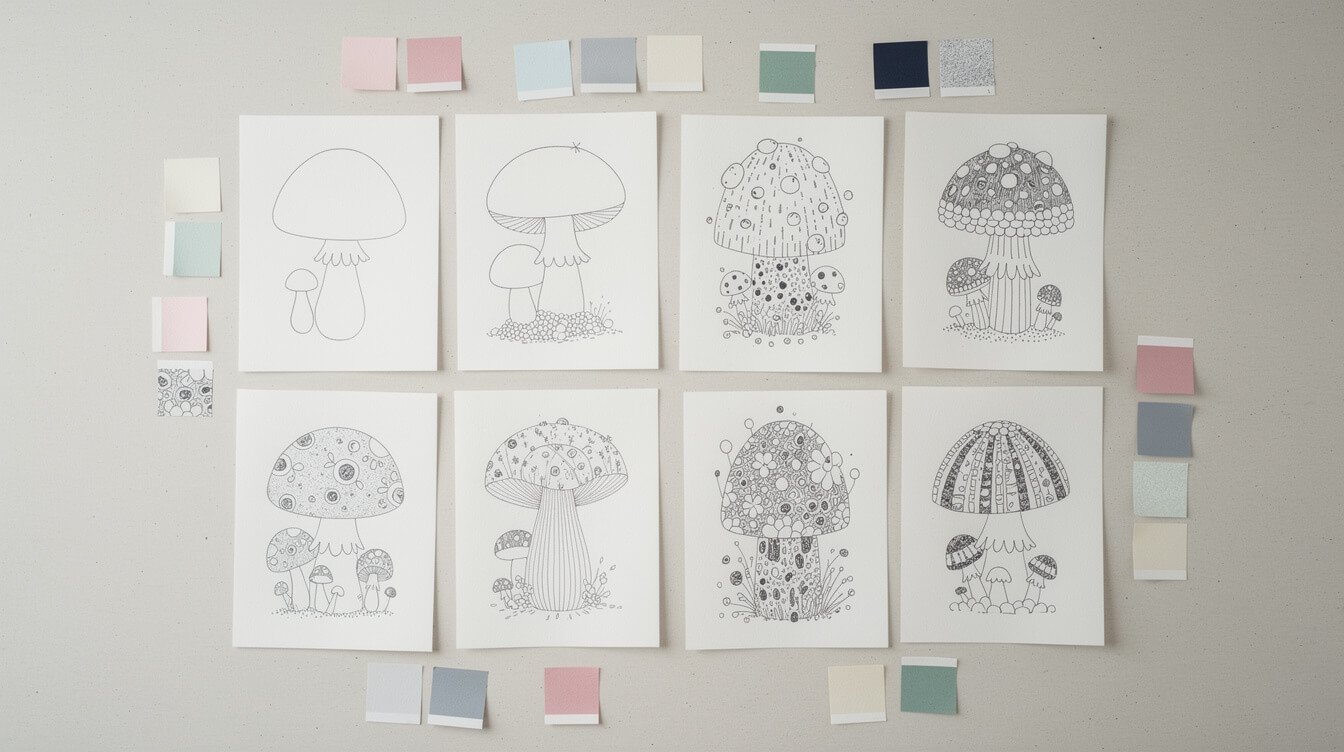
Not every mushroom print earns its place. There is a fairly reliable line between the ones that feel considered and the ones that feel like clip art, and it comes down to a few small choices.
Restraint in color. The best mushroom designs stick to two or three tones, usually a soft sage or moss green, a warm cream, and one accent (a dusty rose cap, a butter-yellow gill). The cliche version reaches for the full cartoon palette: bright red caps, pure white dots, black outlines everywhere. More colors rarely means more charm, and a print that borrows every color in a child’s marker set tends to read younger and cheaper than the person carrying it actually wants.
One motif, not a pattern flood. A single well-placed mushroom illustration, maybe with a small companion or two, tends to read as intentional. A tote covered edge to edge in tiny repeating mushrooms tends to read as decor filler, the tote-bag equivalent of a novelty shower curtain. Negative space does a lot of the work here: a mushroom sitting in a clean, uncluttered corner of canvas looks considered in a way that the same mushroom repeated fifty times across the whole bag never quite manages.
Soft edges over cartoon faces. A mushroom with a gentle, slightly asymmetrical cap reads as naturalistic and calm. A mushroom with a wide cartoon smile and giant eyes reads as childish in a way that skews younger than most cottagecore shoppers actually want. The best designs let the shape itself carry the charm instead of bolting a face onto it, the same restraint that makes a round animal illustration feel grown up rather than like it belongs on a lunchbox.
Put those three together and you get the difference between a mushroom that looks like it belongs on a forest floor and one that looks like it belongs in a party favor bag.
Styling a mushroom tote with the rest of a cottagecore fit
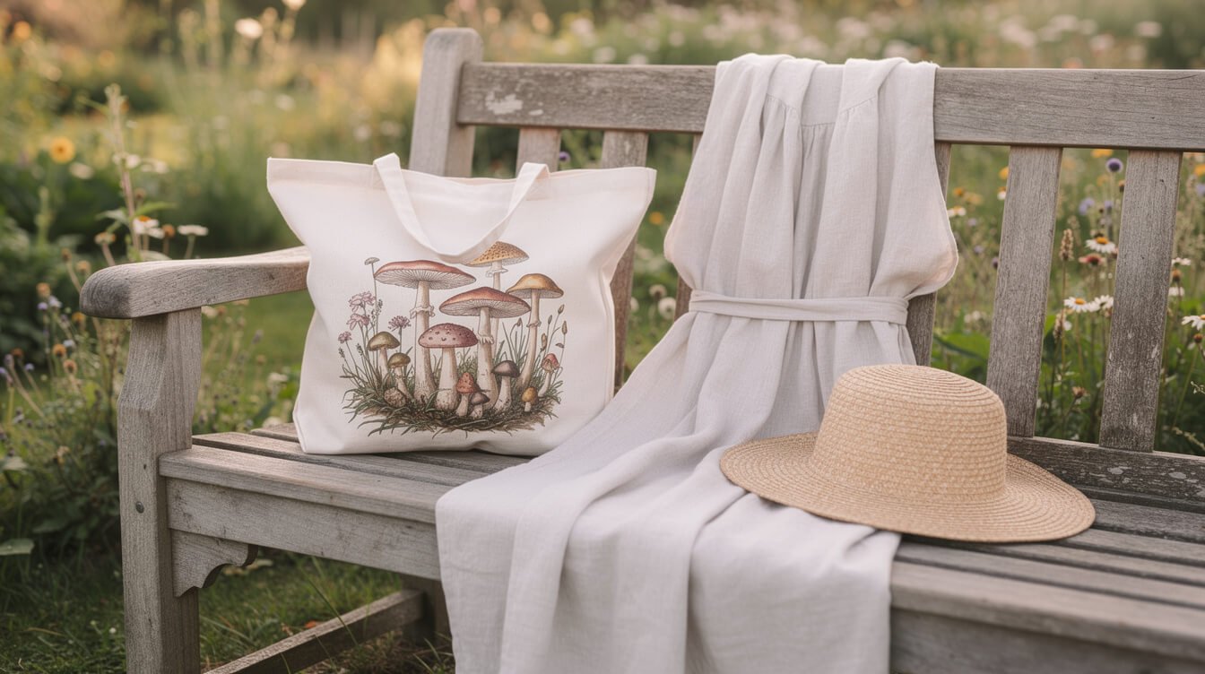
A mushroom tote works best as the one clear focal point of an outfit rather than one more busy element competing for attention. If you already own pieces from the wider cottagecore wardrobe (linen dresses, gauzy blouses, knit cardigans in muted colors), the tote slots in easily. Our guide to cottagecore aesthetic outfits is a good starting point if you are building that wardrobe from scratch.
A few things worth keeping in mind. Let the tote’s palette set the tone for accessories rather than fighting it: if the mushroom print leans sage and cream, keep jewelry and shoes in warm neutrals rather than introducing a bright, unrelated color. Canvas totes also read more put together next to natural textures (linen, straw, wood-handled sunglasses) than next to anything glossy or synthetic, since the whole point of the aesthetic is a handmade, unhurried feel.
Think about proportion too. A small, quiet mushroom print on a mid-sized tote looks intentional. The same print blown up to cover most of a giant oversized bag starts to look like a costume prop rather than an accessory. If the print is delicate, let the bag stay a modest size and let the outfit around it stay simple, a plain sweater and jeans will let a good mushroom tote do more work than a busy floral skirt ever could.
And if you already have an everyday tote you love the shape of, it is worth reading our breakdown of what makes a tote bag design actually cute, since the same principles (proportion, print scale, honest materials) apply whether the print is a mushroom or something else entirely.
Pairing mushrooms with other cottagecore motifs
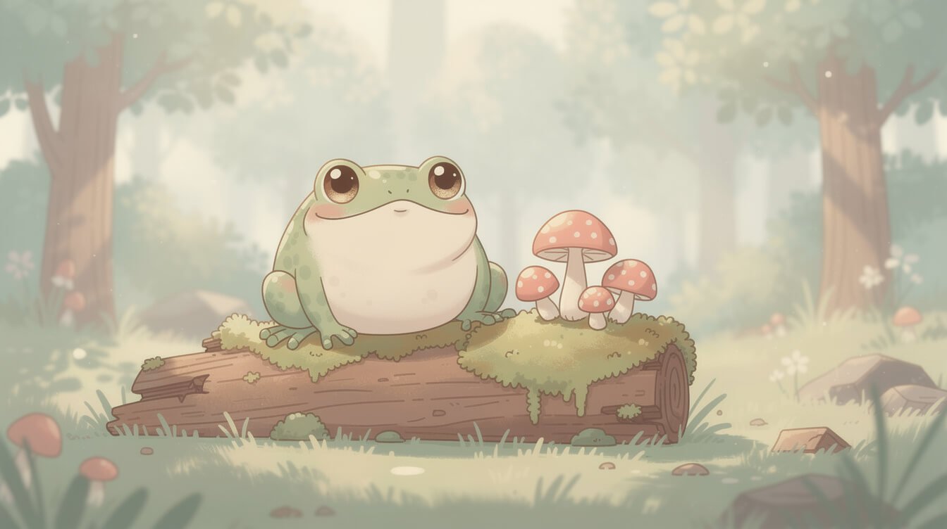
Mushrooms rarely travel alone in cottagecore imagery, and that is part of the appeal. They sit naturally alongside a small cast of forest-floor companions: moss, tiny toadstools in a cluster rather than a single cap, acorns, and, often, a round, friendly frog. If frogs are already your thing, our cute frog gift guide covers a lot of the same soft, round-animal territory that makes the frog and mushroom pairing feel so natural together.
The trick to combining motifs without it turning into visual noise is to let one carry the print and the other show up in a smaller way: a mushroom tote with a tiny embroidered frog tucked near the base, or a mostly plain tote with a small mushroom-and-moss cluster in one corner. Cottagecore imagery works best as a quiet scene rather than a crowded one, a single mossy log with a mushroom and a frog on it says more than a tote covered in every forest creature at once.
The same logic extends to snails, ladybugs, and the occasional hedgehog, all regulars in the same visual world. What ties them together is not the specific creature so much as the shared shape language: round, soft, a little sleepy, nothing with a sharp edge or an aggressive expression. Once you notice that thread, it becomes much easier to tell whether a new design actually belongs in the cottagecore family or is just borrowing its color palette.
It is also worth noticing where the pairings stop. Cottagecore’s forest-floor cast rarely reaches for anything predatory or fast moving, no foxes mid-hunt, no owls swooping in, nothing with teeth bared. The whole scene stays still and unhurried on purpose, a mushroom, a sleeping frog, a trail of moss, because motion and tension would undercut the calm the aesthetic is built around. A design that breaks that stillness, even with an otherwise soft, round animal, tends to feel slightly off no matter how cute the individual creature is on its own.
A few favorite mushroom details to look for
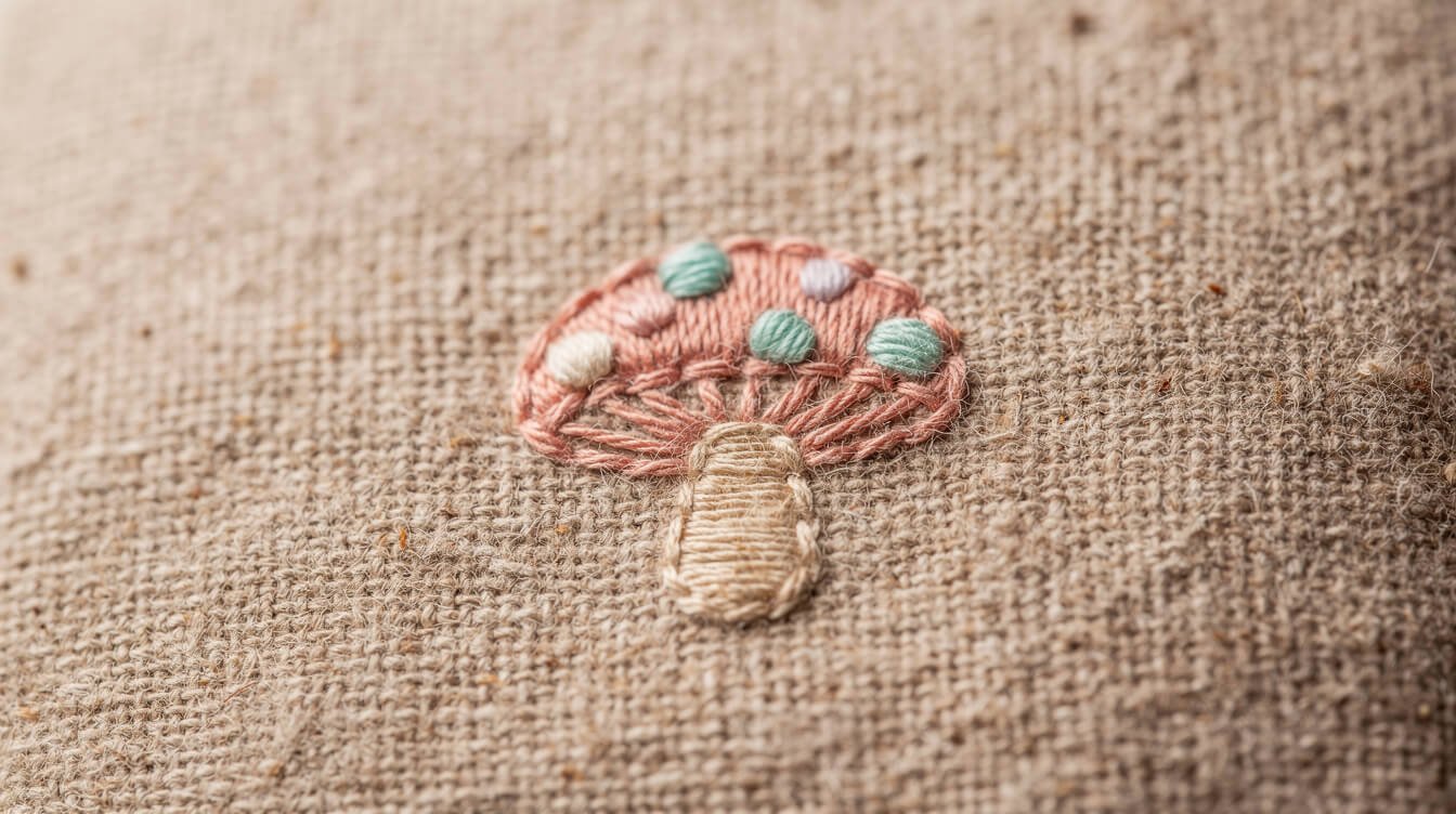
Cute only gets you so far if the bag does not hold up, and this is where a lot of mushroom totes quietly fall apart, sometimes literally. A few details worth checking before you commit to one.
Embroidery over cheap heat-transfer prints. A stitched mushroom holds its shape and color through washes. A printed one tends to crack and fade after a handful of uses, which is a rough way for a design you love to go. Run a thumbnail lightly across the design in photos if you can, a raised, textured surface usually means embroidery, while a perfectly flat surface usually means a print that will not age well.
Canvas weight. A tote meant to be carried daily should feel sturdy in hand, not thin enough to see light through. Lighter canvas is fine for an occasional-use bag, but it is not built for groceries or a stack of library books. Look for language like “heavyweight” or a stated ounce weight in the product details, and be a little skeptical of totes that only describe themselves as “eco-friendly canvas” without saying anything about thickness.
Honest stitching at the handles. The handles are where a tote fails first. Reinforced stitching at the base of each handle, sometimes a small triangle or box pattern, is a small detail, and it is usually the difference between a bag that lasts a season and one that lasts years.
Care matters just as much as construction. A cold, gentle wash and air drying will keep both embroidery and canvas looking sharp for years, while a hot dryer cycle is the fastest way to fade a soft sage green into something duller and to work a printed design loose at the edges. It is a small habit, but it is the difference between a tote that still looks good after two seasons of daily use and one that starts to look tired by the second month.
None of this is about spending more for its own sake. It is the same objection our own customers raise before they buy anything cute: cute is easy to fake, made well is not, and a bag that looks charming in a product photo and falls apart in the wash is not actually the thing anyone wanted in the first place.
Small joys: carrying a little woodland with you
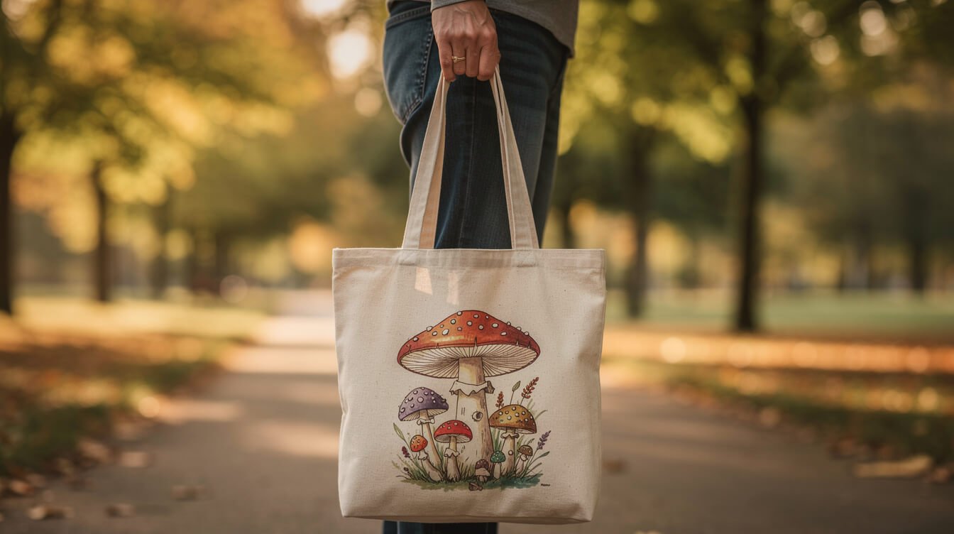
Underneath all the styling notes, the reason a mushroom tote works is a simple one: it is a small piece of a slower, gentler world that you get to carry into an ordinary day. A grocery run, a commute, a walk to get coffee, none of that changes, but the bag on your shoulder gets to feel like it belongs somewhere softer, somewhere with more moss and fewer notifications.
Is the mushroom trend already fading? Not from what the searches and boards show. Cottagecore itself has held steady for years rather than spiking and vanishing, and mushrooms are one of its most durable motifs precisely because they are tied to a whole slow-living aesthetic rather than a single season’s trend cycle.
Can a mushroom tote go with a non-cottagecore wardrobe? Easily, as long as the rest of the outfit is kept simple. A well-restrained mushroom print reads as a quiet detail against plain denim or a solid-color outfit just as comfortably as it does against a full cottagecore look, it does not require the rest of your closet to match a theme.
What if I cannot find a tote, just a mushroom print I love? The same design principles apply to anything with the motif, a patch, a pin, a mug. Look for the same restraint in color and shape, and it will hold up the same way, on a lapel or a shelf just as much as on a shoulder.
We do not have a mushroom tote in our own shop yet, so consider this one a love letter to the motif rather than a pitch. If the cottagecore side of things is what drew you in, our guide to what cottagecore actually means is a good next stop, and it might just send you looking at your own windowsill a little differently.