
Cute aesthetics, explained: how to find the one that is yours
If you have ever saved a picture of a pink bedroom, a mossy stone cottage, and a round little animal in the same afternoon, you have already met three different cute aesthetics without needing the names for them. That is the confusing part. The internet has produced dozens of labels for softness, they all sound adorable, and almost nobody explains how they actually differ or which one describes the thing you keep gravitating toward.
This guide is the sorting exercise. We will cover what the phrase means, why cute took over the internet in the first place, the five cute aesthetics worth knowing by name, and the four quiet variables that separate them. By the end you should be able to look at any soft image and say, with some confidence, which lane it belongs to and whether it is yours.
What people mean by cute aesthetics (and what they do not)

An aesthetic, in the way the word gets used online now, is not quite a style and not quite a mood. It is a shared visual vocabulary. A set of colors, shapes, objects, and settings that a lot of people agreed, mostly without discussing it, belong together. When enough images cluster the same way, someone names the cluster, and the name sticks.
The cute aesthetics are the clusters built on softness rather than sharpness. They favor round over angular, warm over cold, small over large, and gentle over impressive. That is the whole family resemblance. A thatched cottage and a pastel keyboard have nothing in common materially, and yet both read as cute because both are small, soft, and unthreatening.
Here is what the phrase does not mean, because this is where people get stuck. Cute aesthetics are not costumes, and they are not a shopping list. The listicles you will find elsewhere tend to treat each one as a dress you can buy, which gets the relationship backward. You do not acquire an aesthetic by purchasing the five canonical items. You notice that you already lean a certain way, and then you let your choices reflect it. The noticing comes first.
They are also not mutually exclusive. Most people live in the overlap of two or three, and the overlap is usually more interesting than either pure lane. Someone who loves muted greens, dried flowers, and a round animal on a tee is running cottagecore and kawaii at the same time, and nothing bad happens as a result.
Why cute aesthetics took over, and why right now
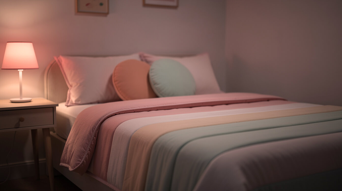
Cute has always been around. What changed is the volume. Cute went from a quality some things happened to have to one of the organizing aesthetics of online life, and there are a few honest reasons for that.
The first is simple and a little sad. Writing in Dazed, the theorist Maya Kronic puts it as plainly as it can be put: we live in un-cute times. When the news is heavy and the future feels expensive, softness stops being decorative and starts being something closer to a need. A round animal on your lock screen is a very small act of self-defense.
The second reason is that cute travels well through a screen. Soft shapes and warm palettes survive compression, thumbnails, and a two second scroll in a way that complicated images do not. An aesthetic built on roundness and pastel is almost purpose-built for a feed, which is why the cute aesthetics multiplied online rather than in magazines.
The third is that naming things is satisfying. Once one cluster had a name, every adjacent cluster wanted one, and the suffix made it easy to generate more. That is how we ended up with a genuinely useful vocabulary and also a great deal of noise. Some of these labels describe a real, coherent visual tradition. Others describe four pictures and a hope. Part of using this vocabulary well is knowing which is which.
Worth saying plainly: none of this makes liking cute things frivolous. Choosing softness on purpose, in a culture that mostly rewards looking tough and busy, takes a small amount of nerve.
The five cute aesthetics worth knowing by name

There are dozens of labels in circulation. These are the five that are genuinely distinct from each other, have enough history to be stable, and cover most of what people actually mean when they say cute. Each one gets a short sketch here, and a link to the full guide if it turns out to be your lane.
Pastel
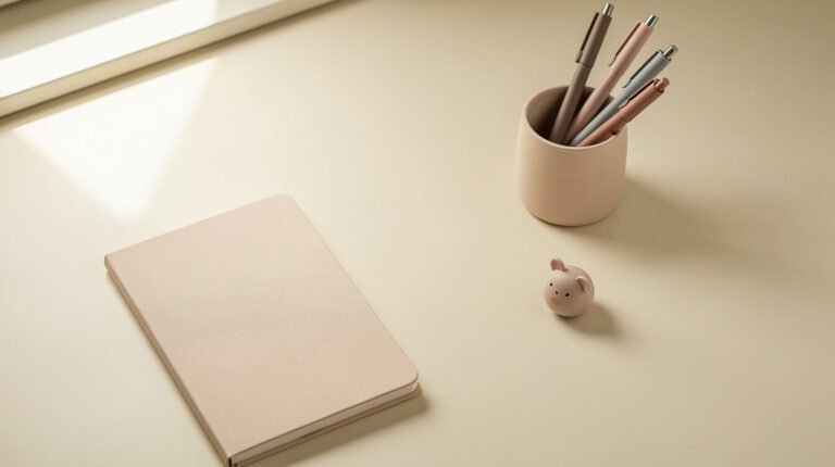
The broadest and most forgiving of the cute aesthetics. Pastel is less a subculture than a color strategy: take any palette and add enough white to lower its volume. The result reads calm because low-saturation color genuinely is easier on the eye, and because pale colors suggest softness in the material sense, like chalk and petals and worn cotton.
Pastel is the one most people start with, partly because it is the least committal. You can have a pastel mug on a very ordinary desk and nothing else about your life needs to change. If the colors are the part you respond to, our guide to what pastel aesthetic actually means goes properly into palette building and why the soft end of the spectrum feels the way it does.
Cottagecore
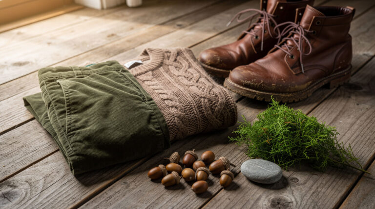
The countryside one. Cottagecore imagines a small, self-sufficient, slightly old-fashioned domestic life: bread, gardens, mending, hens, a kettle that gets used. Its palette is muted rather than pale, leaning on sage, oatmeal, butter yellow, and faded florals. Where pastel is about color, cottagecore is about a whole imagined setting, which makes it the most narrative of the cute aesthetics.
It is also the one most often misread as expensive, because the images tend to feature a cottage. The actual practice is cheap and mostly about pace. We wrote the full explainer at what is cottagecore, a clothing-specific version at what counts as cottagecore clothing, and a wearable outfit guide at cottagecore aesthetic outfits.
Kawaii
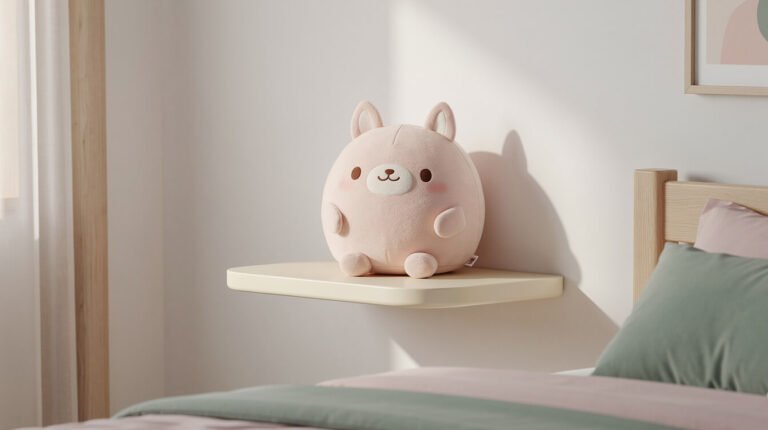
The one with the deepest roots and the most structure behind it. Kawaii is a Japanese design tradition that goes back to the 1970s, and it is a much more specific thing than the English word cute. It is built on character: a face, a personality, a tiny creature with a clear expression. Its palette runs brighter and sweeter than pastel, its shapes are rounder and more deliberately simplified, and it is comfortable with a lot of visual information at once.
The practical difference is that kawaii designs usually look at you. There is someone in the image. If that is the part you like, see what kawaii clothing actually means for wearing it without tipping into costume, and kawaii accessories worth actually carrying around for the small-object version.
Weird cute
The newest of the five, and the most interesting. Weird cute is the lane where the appeal is not conventional prettiness but strangeness: the sea slug that looks like a tiny rabbit, the salamander with the permanent smile, the animal with slightly too many fingers. Its palette is unpredictable because it takes its colors from whatever the real creature happens to be.
What makes it a genuine aesthetic rather than a joke is that it is affectionate rather than ironic. The strangeness is the point of the love, not the punchline. We made the whole case for it in weird cute animals, which also covers the shape principles underneath why any of this works on us at all.
Cozy
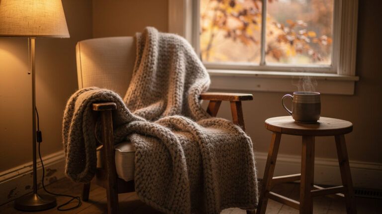
The least visual and most sensory of the cute aesthetics. Cozy is about temperature, texture, and weather. Low warm light, something knitted, something hot in a cup, rain on the other side of the glass. It overlaps heavily with cottagecore but drops the countryside and the self-sufficiency, keeping only the comfort.
Cozy is also the most seasonal, which means it arrives and recedes on a schedule. If it is October where you are, the cozy fall aesthetic is the version of this currently in season, and the cozy cottagecore mug ritual is the smallest possible way to practice it.
What actually separates one cute aesthetic from another

This is the part no other guide seems willing to do, and it is the useful part. If you can read four variables off an image, you can place almost any cute aesthetic without memorizing a single label. The lanes are not arbitrary. They differ along predictable lines.
Palette temperature and saturation
The fastest tell. Kawaii runs bright and sweet, with colors near full strength. Pastel runs pale and cool, the same hues with the volume turned down. Cottagecore and cozy run warm and muted, which is a different move entirely: not whitened but dulled, closer to dye that has faded in sunlight. Hold two images side by side and ask whether the colors are pale, bright, or faded. That one question sorts most of the field.
Shape language
All of the cute aesthetics prefer round. They disagree about how round and how simplified. Kawaii pushes shapes toward the absolute minimum, a circle with two dots, because simplification reads as young and harmless. Cottagecore keeps natural irregularity, since a hand-thrown mug and a real hen are lumpy rather than geometric. Weird cute refuses to tidy the shape at all, which is the whole point of it. We go deeper into why roundness does this to us over in the weird cute animals piece rather than repeating it here.
The setting it imagines
Every cute aesthetic has an implied location, and naming it is clarifying. Cottagecore imagines a rural kitchen. Cozy imagines an interior on a bad-weather day. Kawaii imagines a bedroom, a desk, or a stationery aisle. Pastel does not imagine a place at all, which is exactly why it layers onto the others so easily. Weird cute imagines somewhere genuinely far away, usually a seafloor or a forest floor.
The era it borrows from
The quietest variable and often the real one. Cottagecore borrows from a vague pre-industrial past. Kawaii borrows from a specific and documented twentieth-century design lineage. Pastel borrows from the 1950s and from mid-2010s web design. Cozy borrows from nothing in particular, which is part of its appeal. Weird cute borrows from nature documentaries. Two aesthetics can share a palette entirely and still feel unrelated because they are nostalgic for different decades.
Run those four questions on any image and you will land in the right neighborhood. More usefully, you will start to notice which variable you personally care about, and that is the thing worth knowing.
The cutemerch letter
A small good thing, once a week
One short, kind email with our coziest posts and new round animals from the shop. No spam. Unsubscribe anytime.
How to find which of the cute aesthetics is yours

Here is the method, and it is deliberately unglamorous. Do not start from the labels. Labels are a description of a pattern, so you need the pattern first.
Look at what you have already saved. Open whatever folder or board you keep soft images in, scroll to the bottom, and look at the oldest twenty. Early saves are more honest than recent ones because they predate knowing what the categories were. Ask what the colors have in common, and whether the images contain a creature, a room, or a landscape.
Notice which variable you keep choosing. From the four above, one usually dominates. Some people are palette people and will take any subject in the right colors. Others are creature people, and a round animal lands regardless of palette. Others are weather people, who really only want the rainy window. Knowing which kind you are predicts your taste better than any label does.
Check it against the thing you actually wear and use. This is the honest test, because saving a picture is free and owning something is not. The mug you reach for, the one tee that never makes it back into the drawer. Aspiration lives on the mood board, but your real aesthetic lives in the objects you return to.
Then let two lanes coexist. Most people are a blend, and forcing a single label is how a nice set of preferences turns into a rule you have to obey. One soft anchor object is usually enough to hold a blend together. The Sea Bunny Emotional Support Tee is the piece we reach for when we want this exact example, because it sits in two lanes at once: it is a kawaii badge design, and the creature on it is a genuinely strange real animal from the weird cute lane. One shirt, two aesthetics, no contradiction.
Give the whole process an evening, not a project plan. The goal is a sentence you could say out loud, something like “muted colors, a round animal, and a rainy afternoon.” That sentence will serve you better in a shop than any of the labels will.
Building the look from what you already own
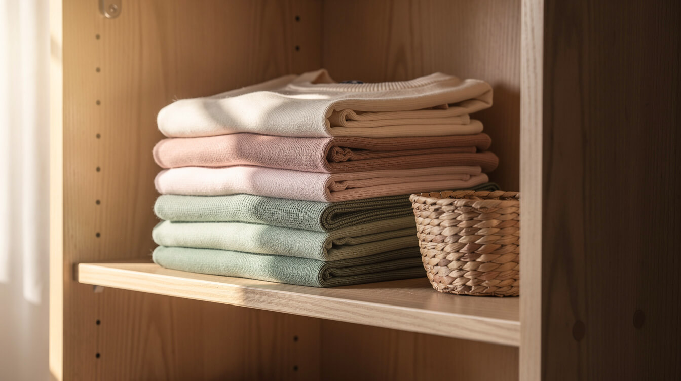
Almost nobody needs to start from zero, and starting from zero is the most common way this goes wrong. The cute aesthetics are cheap to enter and expensive to chase, and the difference is entirely in the order you do things.
Start by subtracting. Most rooms and most outfits read as cluttered rather than un-cute, and softness is extremely sensitive to visual noise. Clearing one surface will do more for the feeling of a room than any single purchase, because an aesthetic needs a little empty space around it to register.
Then fix the light, which is the cheapest high-impact change available. Warm bulbs instead of cool ones, a small lamp instead of the ceiling fixture. Every cozy image you have ever saved is lit from a low, warm source, and that is a two dollar decision rather than a redecoration.
Then audit what you own against your sentence. Most people already have a few pieces in their actual palette and a larger number of near misses. Move the matches to the front. A drawer where the top three tees all land in the same register will make you feel more put together than a new purchase would.
Only then buy, and buy one thing. Pick the piece that does the most work, which is usually the one carrying the motif rather than the color, since color you probably already have. A single well-made tee with a design you genuinely like will outperform a pile of pastel filler, and it will last long enough to still be yours next year. If a round animal is where you landed, our round animal t-shirt guide covers how to wear one so it reads as a choice and not as pajamas, and how to wash graphic tees covers keeping the print soft once you have it.
The quality point is not a sales line, it is the whole difference between an aesthetic that lasts and one that embarrasses you in six months. Thin, generic cute looks adorable in a product photo and sad in person. Cute is worth doing properly.
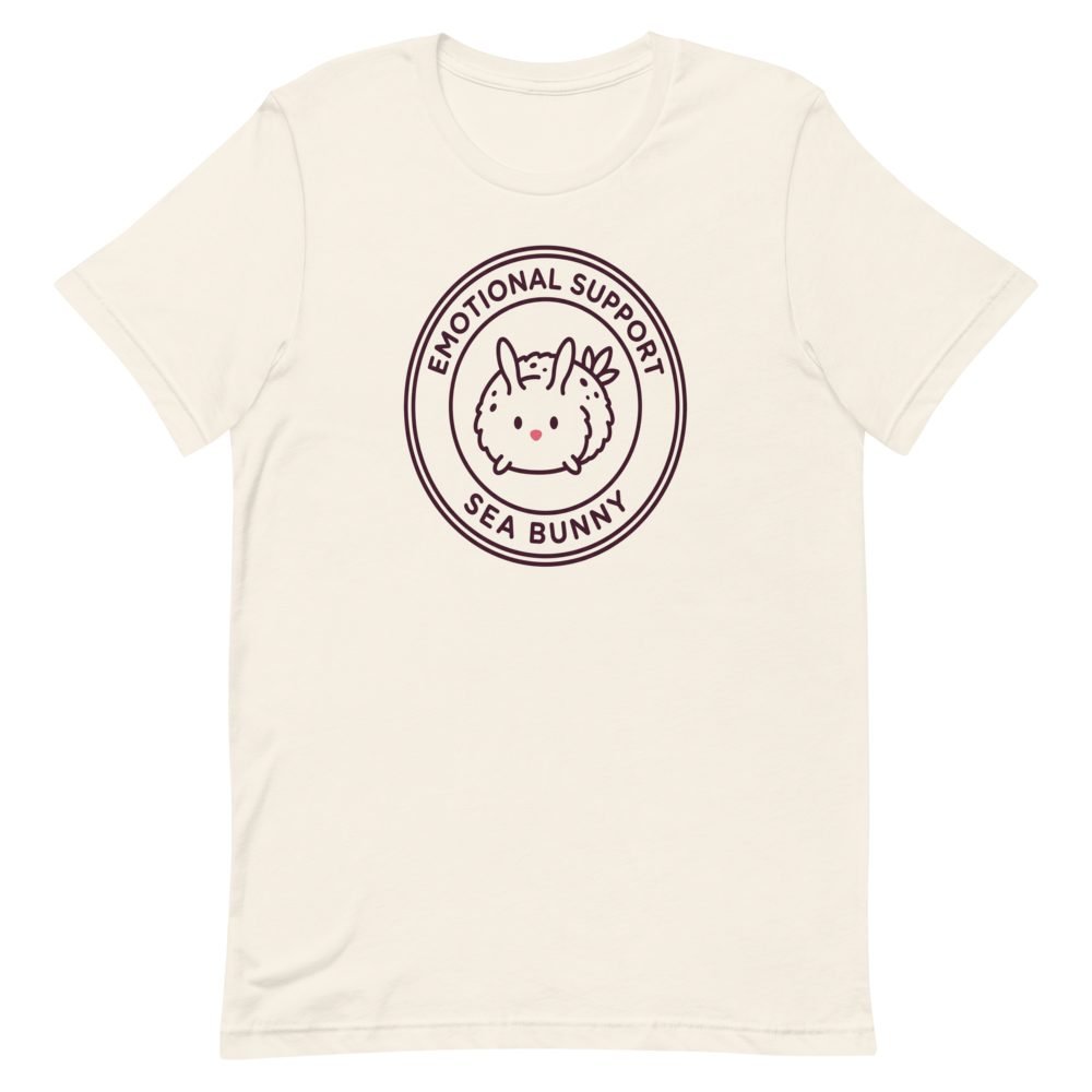
One shirt that sits in two lanes at once
A kawaii badge design of a real sea slug that happens to look like a tiny round rabbit. Soft enough for the pastel lane, strange enough for the weird cute one, and printed on a tee worth keeping.
Frequently asked questions about cute aesthetics
How many cute aesthetics are there?
There is no fixed number, and any guide claiming one is picking a cutoff. Community wikis catalog well over a hundred aesthetics in total, of which a few dozen are cute in some form, but most are variations or very small clusters. The five cute aesthetics in this guide cover the overwhelming majority of what people mean. Treat the rest as useful specificity rather than as a list to complete.
What is the difference between kawaii and cute?
In English they get used interchangeably, but kawaii is substantially bigger than its translation. Cute in English is a description of how something looks. Kawaii is a design tradition with a documented history, a set of visual rules, and a cultural stance behind it, closer to a philosophy of softness than to an adjective. All kawaii things are cute. Not all cute things are kawaii.
Can you mix two cute aesthetics?
Yes, and most people already do. The useful guideline is to mix across variables rather than within one. Two palettes fighting each other looks like a mistake, but one palette carrying a motif from a different lane looks intentional. Hold the colors steady and let the subject roam.
Are cute aesthetics only for young people?
No, and the assumption that they are does a lot of quiet damage. The aesthetics spread fastest among people in their teens and twenties because that is who was on the platforms where the names got coined. Liking soft colors and round animals is not an age-restricted activity. Cute is for everybody, at every age.
Which cute aesthetic is the easiest to start with?
Of the five cute aesthetics here, pastel is the easiest by a wide margin, because it asks for nothing structural. You are choosing colors rather than building a setting, and a single object in the right palette already counts. Cozy is a close second since much of it is light and texture rather than anything you need to buy.
Do I have to pick a label at all?
Not even slightly. The labels are a shortcut for talking to other people and for searching more precisely. If you already know you like faded greens, a smiling animal, and a warm lamp, you have everything the label was going to give you. The vocabulary is a tool, not a membership.
Final thoughts
The cute aesthetics look like a taxonomy problem and they are really a self-knowledge problem. Nobody needs to know that their taste has a name. What helps is being able to say what you actually respond to, because then a shop stops being overwhelming and a room stops being a guess.
So take the four variables, run them on the images you have already saved, and write yourself one sentence. Then change the bulb, clear a surface, and move your favorite thing to the front. That is most of it. The labels will still be there if you want them, and they will have multiplied again by then, and none of that has to matter to you.
What matters is that something in your day is soft on purpose. That is the whole of it, and it was never complicated.
Before you go
Want the next one in your inbox?
We write something soft every day. The best of it lands in one gentle weekly note, for you or for the friend who needs it.